Overview
In the example in the article, we conduct a fictitious joke study where we present either illogical jokes or puns to children, teens, or adults in a 2x3 experimental design and observe the proportions of participants in each condition who cringe at the jokes. We then describe several hypotheses from fictitious cringe theories predicting how the proportions in the different conditions relate to each other.
In this tutorial, you will learn how to input the hypotheses from the cringe theories into the app and obtain the necessary files for conducting Bayesian and frequentist analyses to test these hypotheses in QTest (Regenwetter et al., 2014; Zwilling et al., 2019). In contrast to the article, we begin with a simpler example to introduce and visualize some fundamental concepts such as \({\cal H}\)-representations and \({\cal V}\)-representations.
Simple Example: Three Age Groups
In the simple example, the variable \(p\) represents the probability of cringing, with the indices indicating the age group. Specifically, \(p_{C}\) denotes the probability of children cringing, \(p_{T}\) represents the probability of teens cringing, and \(p_{A}\) indicates the probability of adults cringing. Our cringe theory predicts the following relationships:
\[ p_{C} \geq p_{T} \geq p_{A} \]
That is, children are predicted to have the highest probability of cringing, followed by teens with a lower probability than children, and adults with the lowest probability among the three age groups.
In the Fairy App, we input the following text under the Unique Model Specification section:
p1 > p2 > p3Please note that while the hypothesis derived from the cringe theory uses a \(\geq\) sign, the Shiny app requires a \(>\) sign for easier input. The fairy automatically creates the \({\cal H}\)-representation of the hypothesis. If we also wish to include the \({\cal V}\)-representation, we open the settings for \({\cal V}\)-representations on the left side. We then initiate the process by pressing the Go button, as demonstrated below:
Five new tabs appear to the right of Input in the upper panel:
\({\cal H}\)-representation
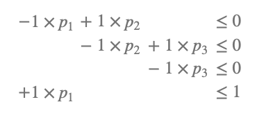
When you choose the \({\cal H}\)-representation tab, the fairy presents a minimal description of your hypothesis. Despite her exceptional proficiency in mathematics, the fairy opts to use an R package (Geyer & Meeden, 2023) to perform the calculations with ease and efficiency. In our example, the output is as follows:
If you are unfamiliar with inequalities, this might initially seem like a magical incantation. However, for the simple example, it is quite straightforward. Let me explain step by step:
The first line states that \(p_1\) must be greater than or equal to \(p_2\), as only in this case will the difference be less than or equal to zero.
The second line indicates that \(p_2\) should be greater than or equal to \(p_3\) for the same reason.
The third and fourth lines state that \(p_3\) must be greater than or equal to 0 (since probabilities cannot be negative), and \(p_1\) must be less than or equal to 1 (since probabilities cannot exceed 1). On the website, in the left area, you can download the necessary files for QTest to test your hypotheses (further details will be explained later). Additionally, you can download a LaTeX file, ready for compilation, which contains the \({\cal H}\)-representation of your model.
Plot
To better understand \({\cal V}\)-representations, let’s start by clicking on the Plot tab. In the Input field for model names, you can enter the name of your model. The standard name for the first model is m1. For convenience, you can also click the + button located under the header Remove or add all models on the left side. This action will generate a three-dimensional plot showcasing the visualization of the model:
Each dimension in the plot represents a probability: \(p_1\), \(p_2\), and \(p_3\). The scale for each probability ranges from 0 to 1, as probabilities can only take values within this range. Thus, the entire cube, with each probability ranging from 0 to 1, represents all possible probabilities in an experimental design with three conditions.
The red translucent figure highlights the probabilities consistent with your model. In other words, all points within the figure satisfy the model \(p_1 > p_2 > p_3\), while the points outside the figure correspond to triples of probabilities that do not fulfill the model.
This geometric figure is known as a polytope, which can be characterized by vertices. A vertex \(V_i\) corresponds to a point \(i\) in the three-dimensional space defined by the coordinates \((p_1, p_2, p_3)\) in the example with three conditions. For the model in the example, we identify four vertices: \(V_1 = (1, 1, 1)\), \(V_2 = (1, 1, 0)\), \(V_3 = (1, 0, 0)\), and \(V_4 = (0, 0, 0)\).
\({\cal V}\)-representation
The four vertices observed in the plot from the previous section represent the \({\cal V}\)-representation of your model. By selecting the \({\cal V}\)-representation tab, you will obtain the vertices listed in a matrix format, as shown below:
Each row in the matrix represents a vertex, while each column corresponds to a probability value. Vertices are valuable because they represent the edge cases of your model.
On the left side of the page, you can download the files of the \({\cal V}\)-representation that QTest can utilize for the analysis. QTest has the ability to handle both \({\cal H}\)- and \({\cal V}\)-representations. However, since \({\cal V}\)-representations can be computationally intensive, users have the flexibility to decide whether they want to include the \({\cal V}\)-representation in the settings on the Input page.
You can scroll through plots of the edge cases of your model under the Plot Edge Cases tab:
In most cases, \({\cal H}\)-representations are sufficient for the calculations in QTest. As a general guideline, it is advisable to refrain from calculating \({\cal V}\)-representations unnecessarily when dealing with more than fifteen probabilities, as they can become impractical and computationally demanding.
Parsimony
The geometric interpretation of a model as a polytope allows us to quantitatively assess the notion of parsimony in hypotheses, often a vague concept. A more parsimonious model is characterized by a polytope with smaller volume. This concept is closely related to Popper’s a priori criteria of empirical content (Glöckner & Betsch, 2011; Popper, 1934/2005), specifically the degree of specificity in the model. Specific predictions create more opportunities to falsify the model, leaving more space outside the polytope for potential disconfirming evidence.
To calculate the volume of the model, navigate to the Parsimony tab, choose at least one algorithm, and click on the Go button. The fairy, ever the resourceful one, utilizes an R package (Fisikopoulos & Chalkis, 2023) to compute volumes:
The model occupies approximately 16% to 17% of the space, as calculated by the three algorithms. Hitting the Go button several times reveals that the volume calculations vary with each run. To stabilize the results, we open the settings of the three algorithms and adjust the upper bound of the approximation error for all three.
Below the graph, a table with numerical values is provided in the following format:
The table provides the volume for all three algorithms (rounded to two decimal places). The volume is also linked to Bayesian analysis: the reciprocal of the volume (i.e., 1/volume) gives the maximum Bayes factor achievable when testing the model against an unconstrained model that allows \(p_1\), \(p_2\), and \(p_3\) to take any value. In this example, the evidence for the model cannot exceed a Bayes factor of about 6. This relationship between volume and Bayes factors is instructive. If your maximum Bayes factor is too low, consider revisiting your stimuli to identify cases where your theory allows for more parsimonious predictions. This is closely related to optimal study design (Myung & Pitt, 2009).
On the left side of the page, you can modify additional settings of the three algorithms to calculate the volumes, but it requires expertise. However, the default settings should work in most cases. Additionally, you can download the results in a .csv table format for further analysis and record-keeping.
Elaborate Example: Three Age Groups x Two Joke Types
In the simple example, you have hopefully acquired an understanding of \({\cal H}\)- and \({\cal V}\)-representations. Additionally, you have become familiar in navigating the app. As we move forward to this section, our focus is on exploring the content covered in the article. The primary goal is to demonstrate how you can effectively utilize the app for the hypotheses motivated in the paper.
In the elaborate example, we add another factor to the study. We either present illogical jokes or puns. We indicate illogical jokes by the symbol \(\looparrowright\) and puns by the symbol \(\heartsuit\) because we love puns, hence the heart. Since we have a 2x3 design, we need to deal with six probabilities:
\(P^\looparrowright_C\): The probability p1 that a randomly drawn child cringes at an illogical joke
\(P^\looparrowright_T\): The probability p2 that a randomly drawn teen cringes at an illogical joke.
\(P^\looparrowright_A\): The probability p3 that a randomly drawn adult cringes at an illogical joke.
\(P^\heartsuit_C\): The probability p4 that a randomly drawn child cringes at a pun.
\(P^\heartsuit_T\): The probability p5 that a randomly drawn teen cringes at a pun.
\(P^\heartsuit_A\): The probability p6 that a randomly drawn adult cringes at a pun.
Hypotheses
In the following, we will restate the hypotheses mentioned in the article. We will not provide any motivation for these hypotheses as it has already been done in the article. The purpose is to demonstrate how to input the hypotheses into the app. You can follow along and copy/paste the input into the app. If you find this process too tedious, you can also upload the linked file on the Input page to load all model specifications at once.
Before we start inputting hypotheses, we need to click the + button under the header Remove last probability or add probability three times to add three additional probabilities to the default three probabilities because we have a total of six probabilities instead of three. Additionally, we should press the + button under the header Remove last model or add model eight times to add eight more model specification windows since we are dealing with nine hypotheses.1
1 Model 10 is a mixture of models 4 and 9. Since mixtures are not currently implemented in the fairy app, we will not discuss this here.
The first model in the article states that cringyness increases with age:
\[ \underbrace{\frac{P^\looparrowright_C + P^\heartsuit_C}{2}}_{\mbox{cringyness for children}} \leq \underbrace{\frac{P^\looparrowright_T +P^\heartsuit_T}{2}}_{\mbox{cringyness for teens}} \leq \underbrace{\frac{P^\looparrowright_A +P^\heartsuit_A}{2}}_{\mbox{cringyness for adults}}. \]
In the modeling fairy app, we input the following text under the Unique Model Specification section in the first window:
1/2 * p1 + 1/2 * p4 < 1/2 * p2 + 1/2 * p5 < 1/2 * p3 + 1/2 * p6The second model in the article states that cringyness increases with age, irrespective of joke type:
\[ \underbrace{P^\looparrowright_C \leq P^\looparrowright_T \leq P^\looparrowright_A}_{\mbox{increase for illogical jokes}} \;\; \mbox{and} \;\;\;\;\;\; \underbrace{P^\heartsuit_C \leq P^\heartsuit_T \leq P^\heartsuit_A}_{\mbox{increase for puns}}. \]
In the modeling fairy app, we input the following text under the Unique Model Specification section in the second window:
p1 < p2 < p3; p4 < p5 < p6Model 3 states that cringyness decreases with age for illogical jokes, whereas it increases with age for puns, and illogical jokes are generally not as cringy as puns:
\[ \underbrace{P^\looparrowright_C \geq P^\looparrowright_T \geq P^\looparrowright_A}_{\mbox{decrease for illogical jokes}} \mbox{and } \underbrace{P^\heartsuit_C \leq P^\heartsuit_T \leq P^\heartsuit_A}_{\mbox{increase for puns}}, \]
\[ \mbox{ and } \]
\[ \underbrace{\frac{P^\looparrowright_C + P^\looparrowright_T + P^\looparrowright_A}{3}}_{\mbox{cringyness of illogical jokes}} \leq~~~ \underbrace{\frac{P^\heartsuit_C + P^\heartsuit_T + P^\heartsuit_A}{3}}_{\mbox{cringyness of puns}}. \]
In the modeling fairy app, we input the following text under the Unique Model Specification section:
p1 > p2 > p3; p4 < p5 < p6; 1/3 * p1 + 1/3 * p2 + 1/3 * p3 < 1/3 * p4 + 1/3 * p5 + 1/3 * p6Model 4 states that cringyness decreases with age for illogical jokes, whereas it increases with age for puns, and illogical jokes are not as cringy as puns, irrespective of age group:
\[ P^\looparrowright_C \geq P^\looparrowright_T \geq P^\looparrowright_A \mbox{ and } P^\heartsuit_C \leq P^\heartsuit_T \leq P^\heartsuit_A, \]
\[ \mbox{ and } \]
\[ P^\looparrowright_C \leq P^\heartsuit_C, \;\; P^\looparrowright_T \leq P^\heartsuit_T, \;\; \mbox{and} \;\; P^\looparrowright_A \leq P^\heartsuit_A . \]
In the modeling fairy app, we input the following text under the Unique Model Specification section:
p1 > p2 > p3; p4 < p5 < p6; p1 < p4; p2 < p5; p3 < p6Model 5 states that both joke types are exactly equally cringe-worthy across all three age groups:
\[ P^\looparrowright_A = P^\heartsuit_A = P^\looparrowright_T = P^\heartsuit_T = P^\looparrowright_C = P^\heartsuit_C. \]
In the modeling fairy app, we input the following text under the Unique Model Specification section:
p1 = p2 = p3 = p4 = p5 = p6Model 6 states that cringyness decreases with age for illogical jokes, whereas it increases with age for puns, but these two sort of ‘balance each other out,’ so that, overall, puns are ‘about equally cringy’ as illogical jokes:
\[ P^\looparrowright_C \geq P^\looparrowright_T \geq P^\looparrowright_A \mbox{ and } P^\heartsuit_C \leq P^\heartsuit_T \leq P^\heartsuit_A, \] \[ \mbox{and} \;\; \frac{P^\looparrowright_C + P^\looparrowright_T + P^\looparrowright_A}{3} = \frac{P^\heartsuit_C + P^\heartsuit_T + P^\heartsuit_A}{3} \]
In the modeling fairy app, we input the following text under the Unique Model Specification section:
p1 > p2 > p3; p4 < p5 < p6; 1/3 * p1 + 1/3 * p2 + 1/3 * p3 = 1/3 * p4 + 1/3 * p5 + 1/3 * p6The formalization on Model 7 interprets the verbal term ‘about equally cringy’ from Model 6 differently. In m7, cringyness of puns versus illogical jokes averaged over age groups do not need to be exactly the same but are allowed to deviate by .05 probability:
\[ P^\looparrowright_C \geq P^\looparrowright_T \geq P^\looparrowright_A \mbox{ and } P^\heartsuit_C \leq P^\heartsuit_T \leq P^\heartsuit_A, \]
\[\mbox{and}\] \[ \;\; \left| \frac{P^\looparrowright_A + P^\looparrowright_T + P^\looparrowright_C}{3} - \frac{P^\heartsuit_A + P^\heartsuit_T + P^\heartsuit_C}{3} \right|\leq 0.05 \]
For m7, we use the same input as for m6. In the app, we add the value of 0.05 in settings Approximate equalities for m7. The final video in this section demonstrates how to input these approximate equalities in the app.
m8 predicts that all six probabilities are the same as in m5. However, m8 allows for some variation, with probabilities differing by a wiggle space of \(.05\):
\[ |p_i - p_j| \leq 0.05, \mbox{ for each distinct pair } p_i, p_j. \]
In the modeling fairy app, we input the following text under the Unique Model Specification section:
{p1,p2,p3,p4,p5,p6} = {p1,p2,p3,p4,p5,p6}The input {p1,p2,p3,p4,p5,p6} = {p1,p2,p3,p4,p5,p6} is a shortcut for p1 = p2; p1 = p3; p1 = p4; …; p5 = p6 (i.e., every element on the left is set equal to each element on the right, with expressions like p1 = p1 removed). In the app, we add the value of 0.05 in settings Approximate equalities for m8.
m9 predicts the opposite of m4:
\[ P^\looparrowright_C \leq P^\looparrowright_T \leq P^\looparrowright_A \mbox{ and } P^\heartsuit_C \geq P^\heartsuit_T \geq P^\heartsuit_A, \]
\[ \mbox{ and } \]
\[ P^\looparrowright_C \geq P^\heartsuit_C , \;\; P^\looparrowright_T \geq P^\heartsuit_T, \;\; \mbox{and} \;\; P^\looparrowright_A \geq P^\heartsuit_A. \]
In the modeling fairy app, we input the following text under the Unique Model Specification section:
p1 < p2 < p3; p4 > p5 > p6; p1 > p4; p2 > p5; p3 > p6All the steps for inputting hypotheses are demonstrated in the following short video clip.
Note that you can download the \({\cal H}\)-representation needed for QTest (see below) from the webpage under the header \({\cal H}\)-representation. Model 10 described in the paper cannot be easily created with the current version of the app. We provide \({\cal H}\)- and \({\cal V}\)-representations for all models for download here.
Intersections
Hypotheses may make similar predictions to some extent. To determine the degree of shared predictions, we can refer back to the concept of hypotheses as polytopes in space. If a model shares predictions with another model, it means that the two polytopes overlap to some extent in space. The fairy can easily calculate the shared space, which is referred to as the intersection of the hypotheses.
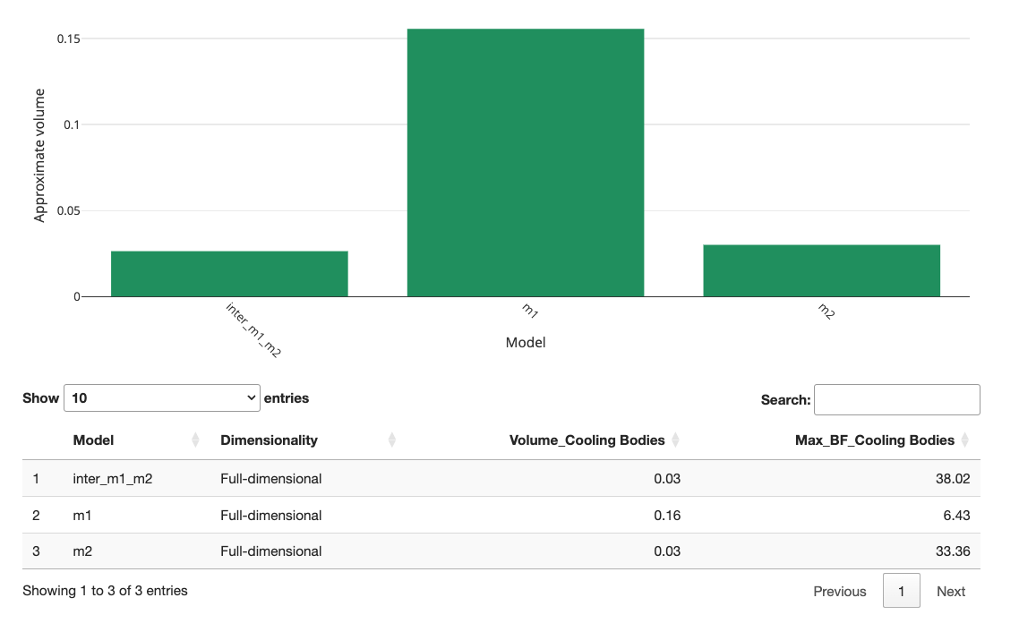
In the example with the nine hypotheses, you might ask yourself to what extent m1 and m2 overlap. Just add another model specification and input the unique model specifications of m1 and m2:
1/2 * p1 + 1/2 * p4 < 1/2 * p2 + 1/2 * p5 < 1/2 * p3 + 1/2 * p6; p1 < p2 < p3; p4 < p5 < p6The next video demonstrates how to input the intersection model. We begin by entering Model 1 and Model 2, along with the intersection, to simplify the presentation for this tutorial. However, you can also add another model after the nine models you created earlier to define the intersections.
When we re-run the volume calculations, the fairy gives us the following plot for m1, m2, and the intersection of both:
As you can see, the volume of the intersection is the same height as m2, meaning m1 completely overlaps with m2. This is also referred to as m2 being nested within m1. This implies that when the data are consistent with m2, they are also consistent with m1. However, due to its smaller volume, m2 will be preferred in Bayesian analysis to account for model parsimony.
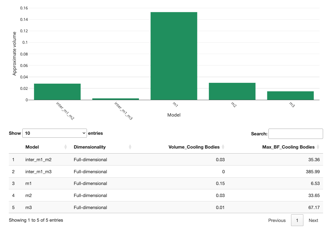
Let’s look at another case. To what extent do m1 and m3 overlap? We add another model specification and input the unique model specifications of m1 and m3 the following:
1/2 * p1 + 1/2 * p4 < 1/2 * p2 + 1/2 * p5 < 1/2 * p3 + 1/2 * p6; p1 > p2 > p3; p4 < p5 < p6; 1/3 * p1 + 1/3 * p2 + 1/3 * p3 < 1/3 * p4 + 1/3 * p5 + 1/3 * p6How to input the intersection model is demonstrated in the video:
When we re-calculate the volumes, we get the following graph:
As you can observe, m1 and m3 exhibit some overlap but do not fully overlap. Consequently, the two hypotheses predict distinctly different outcomes. Generally, it is better to have little or no overlap between hypotheses. If the overlap is too large, you might want to reconsider the stimuli in your study. Intersections can help you check whether your study can differentiate between hypotheses before investing resources in conducting the study.
As a final example, let us create the \({\cal H}\)-representation of the intersection of Model 4 and Model 9. The surfaces of both models touch each other, indicating that only values satisfying p1 = p2 = p3 = p4 = p5 = p6 belong to both models. This also means that the intersection has volume zero because it is not full-dimensional. Note that this specification is identical to that of Model 5. As shown towards the end of the video, although m5 and the intersection of m4 and m9 are identical, their \({\cal H}\)-representation can differ because there is no unique \({\cal H}\)-representation in this case.
Analysis in QTest
Preparation
Before we start the actual analysis, we need to first download and install QTest. Download links for both the Mac and Windows operating systems are available on the website here.
Of the many analyses that the Shiny app provides, the \({\cal H}\)-representation is key to running statistical analyses in QTest. Now that we have obtained the \({\cal H}\)-representations for all models using the fairy app, we will walk through how to test our hypotheses using QTest and how to view the results. As a demonstration, we will take a look at how much evidence the made-up data presented in Table 1 provide against, or in support of, the first hypothesis as formalized in Note 1.
| Cringe at illogical jokes | No Cringe at illogical jokes | Cringe at puns | No Cringe at puns | |
|---|---|---|---|---|
| Children | 60 | 40 | 60 | 40 |
| Teens | 64 | 36 | 50 | 50 |
| Adult | 68 | 32 | 38 | 62 |
Next, recall that, under the “\({\cal H}\)-representation” tab in the Shiny app, we can download the file that contains the \({\cal H}\)-representation of our model of interest in a tar-archive file. Before we start our analysis, we extract the text file that contains the \({\cal H}\)-representation of m1. You can also download the file created by the fairy app for Model 1 here, all models reported in the article are also included on the OSF-website here.
We also need to make sure that the constraints in the \({\cal H}\)-representation and the way in which we communicate the empirical data to QTest are properly aligned. (The same applies to any \({\cal V}\)-representation when communicating that to QTest.) To this end we will create labels for all possible types of observations. For instance, we may observe that a child cringes at the pun. We may observe that a teen does not cringe at the illogical joke. In the manuscript, there are 3 x 2 x 2 = 12 different types of observations: Children, teens, and adults (3 cases) may cringe or not cringe (2 possible responses) at the pun or the illogical joke (2 cases). We will use
- “A” to denote that a child cringes at the illogical joke,
- “B” to denote that a child does not cringe at the illogical joke,
- “C” to denote that a teen cringes at the illogical joke,
- “D” to denote that a teen does not cringe at the illogical joke,
- “E” to denote that an adult cringes at the illogical joke,
- “F” to denote that an adult does not cringe at the illogical joke,
- “G” to denote that a child cringes at the pun,
- “H” to denote that a child does not cringe at the pun,
- “I” to denote that a teen cringes at the pun,
- “J” to denote that a teen does not cringe at the pun,
- “K” to denote that an adult cringes at the pun,
- “L” to denote that an adult does not cringe at the pun.
Note that QTest only uses letter labels: The user needs to keep track of their meanings separately.
Setting dimensions / Coordinates
After opening up QTest, we need to first specify the number and names of parameters that the models use, in a fashion consistent with how we coded the order-constraints. We enter this information in the “Gamble pairs” panel that is located in the top left of the interface.
To create the correct number of parameters, QTest requires that we first indicate a number of “gambles.” The original QTest interface was designed for decision making research. Here, think of each “gamble” as a label for a possible type of observation. In the preparatory work above, we ear-marked 12 labels. Having specified that we need 12 labels, if we click on “Set…”, we see that QTest provides a huge list of possible label pairs. This step defines the Binomial parameters that we use in our models.
The labeling must be consistent with the \({\cal H}\)-representation. In this list, we select the 6 pairs that correspond to the six Binomials that we are interested in: The appropriate labels for the 6 Binomial parameters are therefore “(A,B),” “(C,D),” “(E,F),” “(G,H),” “(I,J),” and “(K,L)”.
Among these, for instance “(I,J)” denotes the Binomial process for teens and puns, in which “I” denotes the outcome that the teen cringes at the pun, whereas “J” denotes the outcome that the teen does not cringe at the pun.
All the steps just explained for setting up the dimensions are illustrated in the following video.
We must ensure that we do not accidentally code the Binomials in opposite ways between the Shiny app and QTest: Say, if p1 denoted the probability of “cringing” in the Shiny app, but “A” denoted “not cringing” in QTest whereas “B” denoted “cringing,” then the QTest coordinate system would mismatch that in the Shiny app and the resulting QTest analyses would be wrong because the data and/or order-constraints would be coded incorrectly in QTest.
Loading Data
To input the empirical data, we navigate to the “Data” panel in the lower left corner of the GUI. There are two methods for entering data. The first method is to input the data manually using the “Enter” button. You can see all the steps in the video clip below. To learn how to load data from a file and how to load multiple data sets, refer to the general-purpose QTest tutorial available for download here.
When manually entering data in QTest, you have two options:
- Using a Preset Sample Size: If you set the “Sample size N” to some value, you only need to enter the first value for each coordinate. QTest will automatically calculate the second. For instance, if you set the preset “Sample size N” to 100 and enter 60 for A, QTest will automatically fill in 40 for B.
- Entering All Data Manually: If your sample size varies between Binomials, you can enter all observations by hand and ignore the “Sample size N” option. QTest will later display the range of sample sizes based on your input.
We use the preset option in the tutorial, as shown in the next video. ]{.aside}
We recommend that you verify whether you coded the data consistently with the coordinate system you created earlier. In the video clip above, the “Data” section shows that “A” was observed 60 times, “B” 40 times, “C” 64 times, and “L” 62 times.
Loading a Model
To load a model into the software, we move to the “Probabilistic specifications” panel that is located to the right of the “Data” panel.
The QTest GUI offers three types of specifications, all of them labeled for use in decision making research. We use what QTest calls the “Random preference” specification, as a backdoor. We load Model 1 by clicking on the “Load” button and selecting the “m1.txt” file in the pop-up window.
All the steps for loading Model 1 are illustrated in the following video.
Like above for the data, it is a good idea to cross-check that the order-constraints in the txt file are also aligned with the coding of our coordinate system in QTest to ensure that we do not end up running nonsensical analyses. To that end, we cross-check the Shiny app constraints that we exported as a QTest compatible machine readable file. The first probability (\(p_1\)) is the probability that a child cringes at the pun. The first Binomial parameter in the “Gamble pairs” panel of QTest is “(A,B),” where “A” is the event that a child cringes at the illogical joke. Since p1 is indeed the probability of observing “A,” and 1-p1 is indeed the probability of observing “B,” we have perfect alignment between the first coordinate in QTest and the first parameter in the Shiny app. It is worthwhile to cross-check each of the parameters in QTest against each of the parameters in the Shiny app to make sure that we communicated the information correctly from the Shiny app to QTest.
Analysis
We next move to the “Hypothesis testing” panel to demonstrate how we can run different analyses in QTest. Right beneath the “Run test” button, there are three panels. Since we are only examining one hypothesis at a time, we leave the “Theories” and “Specifications” panels at their default settings. Since we are only looking at a single dataset, we can also leave the “Data sets” panel at the default setting. If we wanted to look at multiple data sets, then we could choose the option “All” for “Data sets.”
In the next panel, we choose which type of analysis we want to run (QTest calls this the “Type of test”). Note, we advise against choosing the “all” option because different types of analyses require different settings for optimal performance.
To compute a frequentist \(p\)-value, choose the “Frequentist” option. Then click on the “Run test” button at the top of the “Hypothesis testing” panel to run the analysis.
There is no (algorithm for) a frequentist test of an order-constrained model that is not full-dimensional (Davis-Stober, 2009). Here, Models 5 (see Note 2) and 6 (see Note 3) are one-, respectively five-dimensional. Hence, QTest cannot run a frequentist test. However, since Model 5 is not order-constrained, it can be tested using standard tools outside of QTest.
To compute a Bayesian \(p\) value, choose the “Bayes \(p\) & DIC” option in the “Type of test” panel. Before launching the analysis, we further adjust some options immediately beneath to customize our analysis. Since QTest uses two (distinct) Gibbs sampling algorithms to calculate Bayes \(p\) and Bayes factors, we need to indicate the number of samples, the burn-in size, and a random seed for the pertinent Gibbs sampler. The number of draws is relevant to all users, whereas only advanced users need to worry about changing the burn-in size from its default. The random seed is useful for all users. We will talk about it below when we discuss how to assess convergence of a Gibbs sampling algorithm. We recommend starting with a “Sample size” of 100,000 draws and then scaling up if the estimates of the Bayes \(p\) is not converging. We discuss how to assess convergence in the next section. In our example, we draw 100,000 samples and use 1,000 as the burn-in size. To select a sample size for the Gibbs Sampler, click on the “Change” button next to “Sample size:” and input, for instance, “100000.” (To change the burn-in size, follow the analogous steps.)
To compute Bayes factors, the users choose the “Bayes factor” option in the “Type of test” section. Similar to the Bayes \(p\) analysis, we can also adjust the sample size for the Gibbs sampler algorithm, the burn-in size, and the random seed number. To indicate the sample size you would like to use, click on the “Change” button next to “Sample size,” and input your preferred value. A reasonable number here would be 1,000,000. (Advanced users can change the burn-in size similarly.) After you are done with your customization, click on the “Run test” button at the top of the “Hypothesis testing” panel to run the analysis.
The following video demonstrates all the steps for setting up the analysis as explained above. Please note that we edited the video to keep it brief.
Before we investigate the results, there is one more important point to address. Because order-constrained analytics utilize Monte Carlo simulation methods, a user should assess convergence for all results to ensure that the estimates are sufficiently accurate. This usually only affects Bayesian \(p\) value and Bayes factor computations. We consider, for brevity, the latter next.
One way to check whether our estimates of the Bayes factor have converged is to run the same analysis using two or more different random seeds. To change the seed you are using for the analysis, click on the “Set” button in the “Random number seed” panel. As a demonstration in the next video, we input “2” as our second random seed. Below, we will compare the results from the two different seeds to see whether the Bayes factors are substantially different. The differences give us a gauge of how well the algorithms have converged to an accurate result.
We can view the results from our analyses in the “Results” table located at the bottom of the “Hypothesis testing” panel. To view a summary table with results from all of your analyses, click on the “Table” button. To examine results from a single analysis in detail, first select the analysis by clicking on it, then click the “Details” button.
The following video demonstrates all the steps for conducting a repeated analysis and examining all the results.
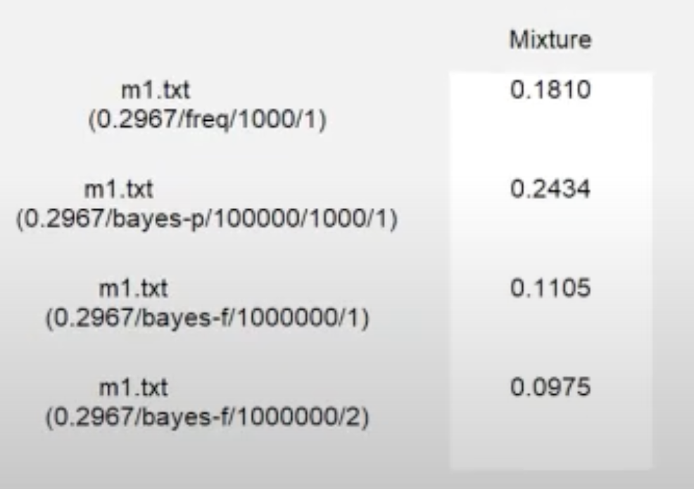
Looking at the results from the analysis as displayed below, we see that the frequentist \(p\)-value is 0.1810. A frequentist \(p\)-value of 0.1810 (since it exceeds \(\alpha =0.05\)) suggests an adequate fit of m1 on the data. The Bayesian \(p\) value is 0.2434. A Bayesian \(p\) value of 0.2434 (since it exceeds \(0.05\)) indicates an adequate fit of m1 on the data.
Looking at the details from the multiple Bayes factor analyses, we see that the Bayes factor estimate from the first seed is 0.1105 and the Bayes factor estimate from the second seed is 0.0975. A Bayes factor around \(0.1 \pm 0.02\) would indicate that, despite the adequate fit of the model when viewed through the frequentist and Bayesian \(p\) values, we have “substantial” or “strong” evidence against m1 in comparison to the unconstrained model (Jeffreys, 1998) when weighing fit against parsimony.
If the range \(0.1 \pm 0.02\) is correct, the conclusion that this model is not viable does not depend on obtaining a higher level of precision for the Bayes factor estimate. Depending on the situation, it may, therefore, not be critically important to invest more computing power and time into achieving higher precision for this Bayes factor (but see below).
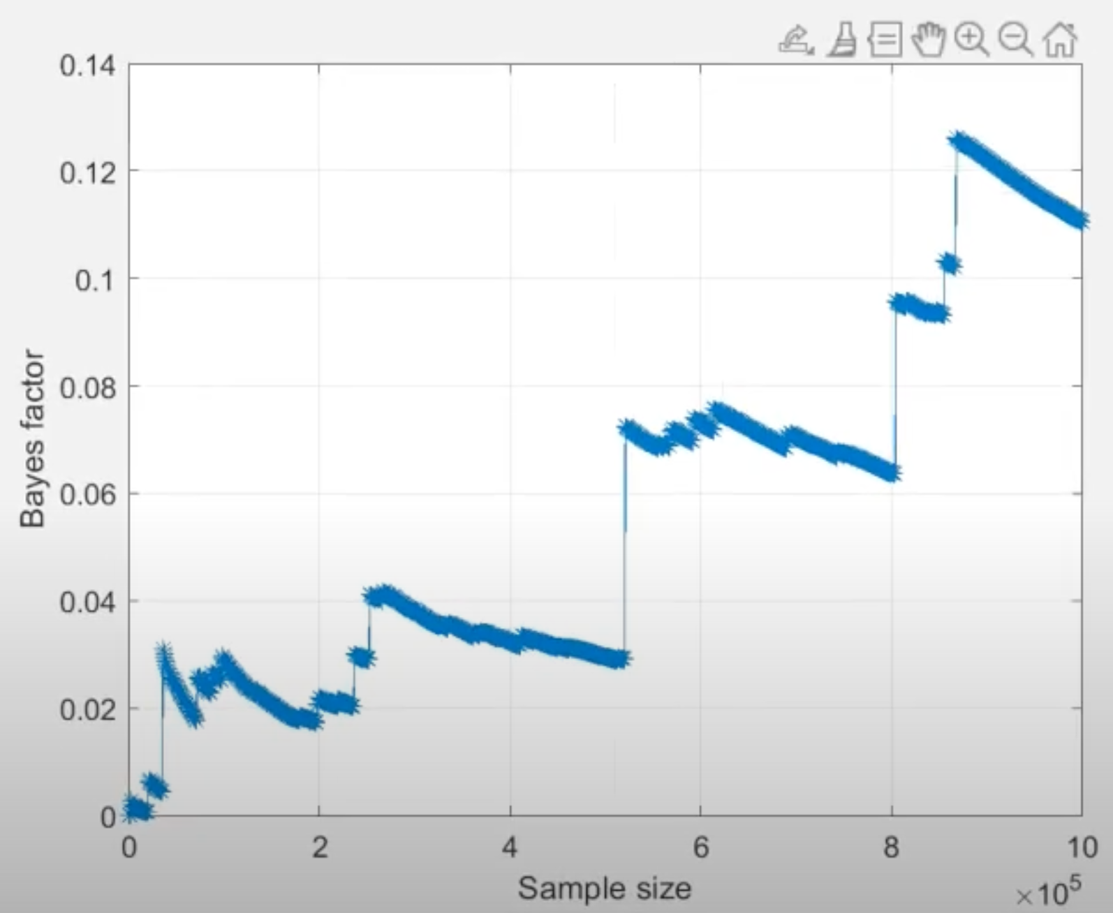
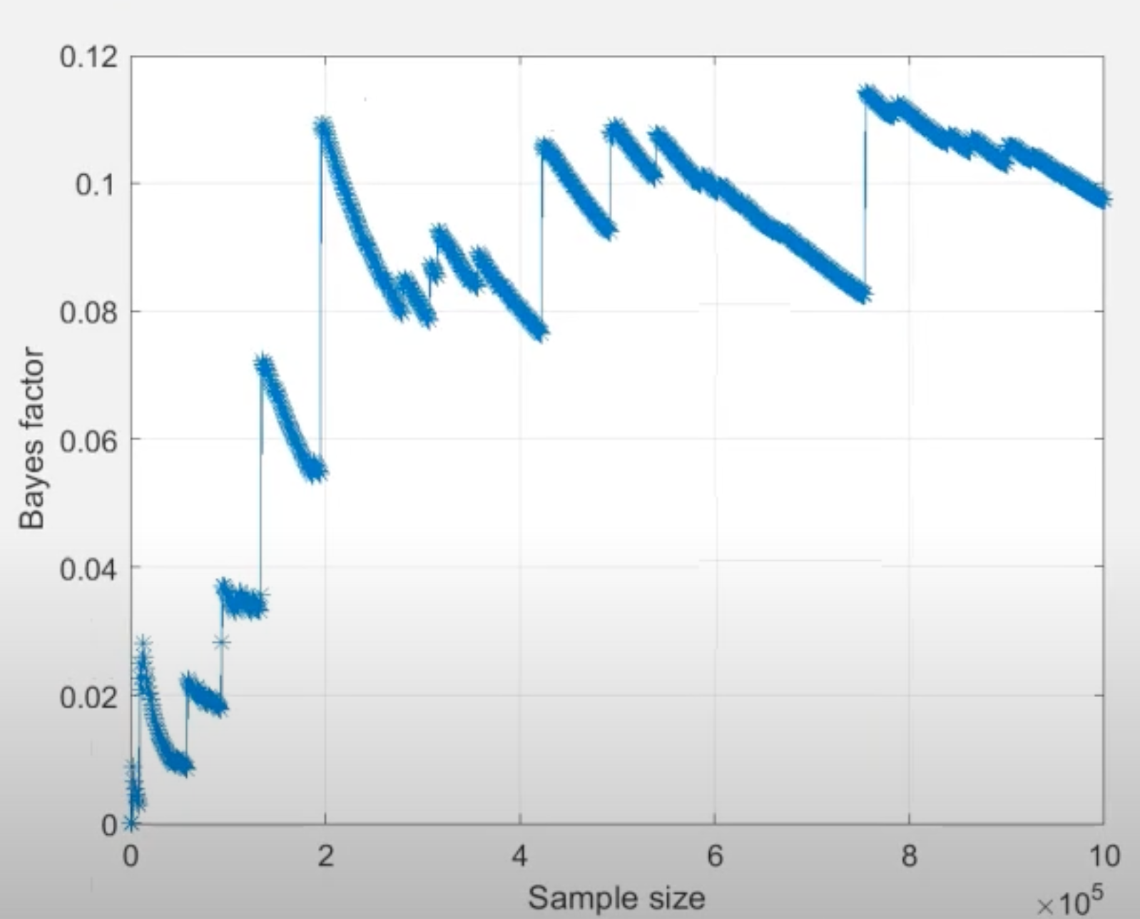
Another useful tool to examine convergence of Bayes factor estimates is the “convergence plot” as displayed below for seed 1 and 2. After selecting a Bayes factor analysis in the lower right panel, click on the “Details” button underneath the table of results to view details about the analysis and the corresponding convergence plot. The horizontal axis is the cumulative sample size of the Gibbs sampler, which is effectively the same as computation time flowing from left to right. The vertical axis is the estimate of the Bayes factor at that time point.
Based on the “jumps” displayed towards the end of both convergence plots, we conclude that the Bayes factor estimate has remained unstable throughout the computation, hence it has not converged. For convergence, we would need to increase the number of draws until we see a smooth horizontal trend in the right side of the convergence plot.2
2 A horizontal convergence plot is a prerequisite, but not a guarantee of convergence. We recommend consulting with tutorial resources (e.g., Regenwetter, 2020; Regenwetter & Cavagnaro, 2019; Regenwetter & Robinson, 2019, for order-constrained analytics) on how to determine what constitutes sufficiently good evidence of convergence of an approximation algorithm.
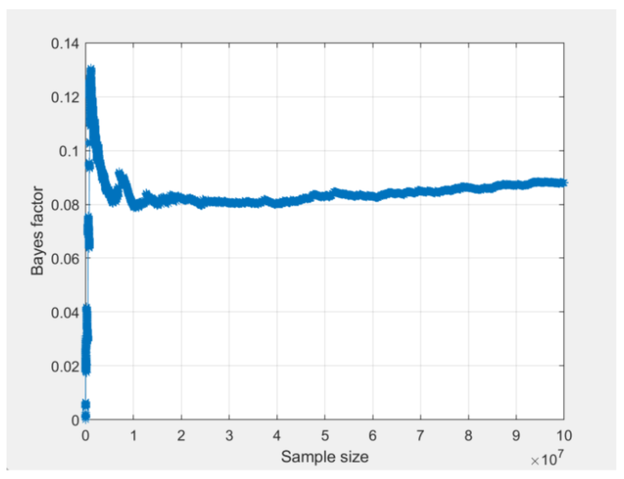
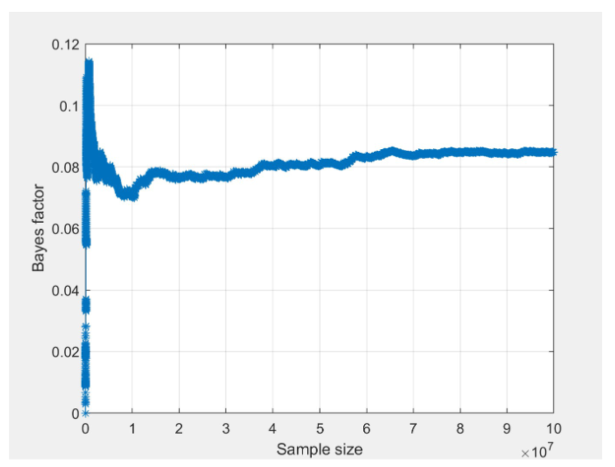
To get results with better convergence, we increase the draw size to 100,000,000 draws. The screenshot below shows the convergence plots for m1 from the two different seeds, after increasing the draw size to 100,000,000 (notice that the vertical axis in the two QTest convergence plots is scaled slightly differently). In contrast to the convergence plots presented above, these convergence plots have smooth horizontal trends on the right side.
The lack of “jumps” towards the end of the plots show that the estimate of the Bayes factor has stabilized. Furthermore, when we compare the two convergence plots, we can see that they both stabilize around the same time and are trending towards the same value between 0.08 and 0.09. The actual value of the Bayes factor for both runs can be viewed by clicking the “Table…” button as demonstrated in the last video.
Although we could invest more computing power to reach more precise convergence, this would not change our conclusion that this model is not viable. Thus, we are satisfied with this level of convergence and report our results to the nearest converged decimal place.
For your convenience, to quickly re-run the analysis without going through the steps of preparation, setting dimensions, and loading data, you can load this file in QTest by pressing “Load” in the “File” section below the visualization section as demonstrated in the final video.

